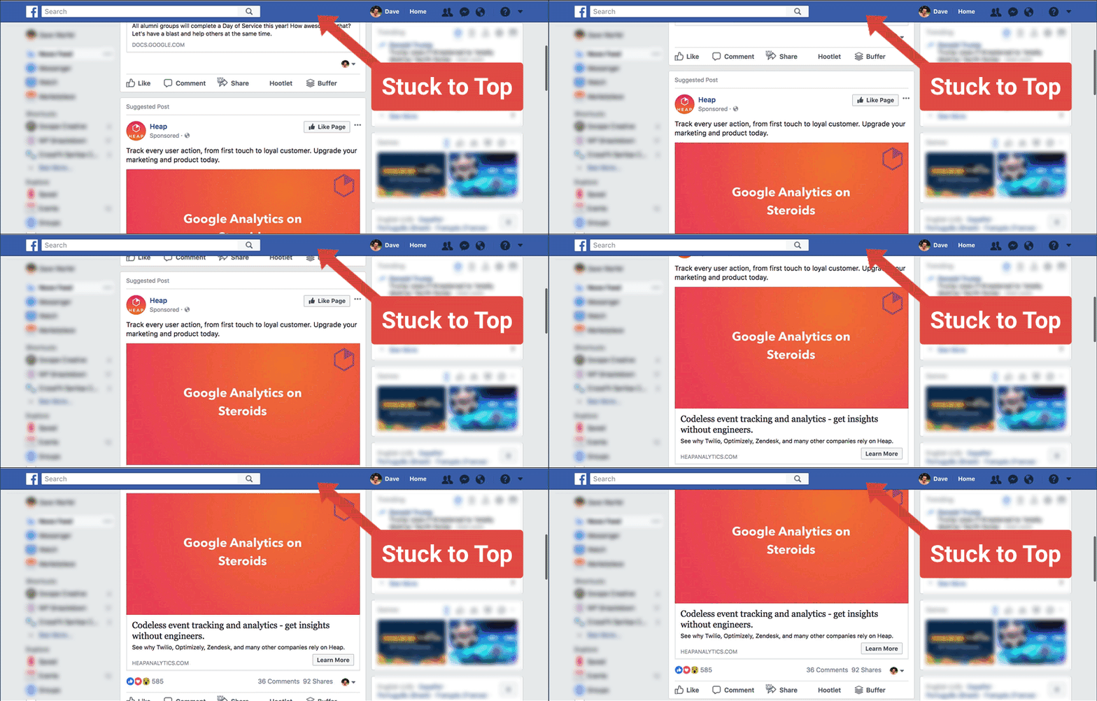
How can you benefit from sticky headers on your website? Dos and donts of sticky headers implementation

A lot of times when we visit websites we actually get to experience components that are generally known as sticky headers on the web pages.
Sometimes they are annoying because they seem to keep following us as we navigate upwards and downwards through the page.
A lot of times they are not so annoying because 99% of the time they help provide us immediate access to the navigation menu just incase we need to visit other pages on the website or application.
Well, seems sticky headers are now a necessary evil, sort of.
In this post we are going to examine the advantages of having a sticky header on your website for users and also talk about the best design approaches that will not make them as annoying as they tend to be when they take up all the space at the top of the device screen.
Do you need sticky headers?
Well, the answer to that depends totally on you as the website owner.
Some owners might not like the fact that sticky headers might take up a large amount of space at the topmost part of their screens and might end up blocking them from viewing certain content on sites where CSS is not properly implemented.
But as vexing as a scenario like that might be, website owners might end up missing out on a very convenient way of getting more and more users to convert for their offered products and services.
Recently, I started visiting a number of websites and tried to note which ones of the had sticky headers implemented on their pages and which ones didn't. From the ones that I found to be using sticky headers, I categorized them into two using the efficiency of their designs as a metric.
The well designed ones I found out had some characteristics in common, first of those is that they were all minimally designed and didn't take up much space on the screen. An example is the image below

By not taking too much space the sticky header would really not appear intrusive to the users of the website and that makes for a great user experience. In my opinion, a lot of badly designed sticky headers were borne out of desperation on the part of the site administrators to get more offers and features into view for their users to choose from.
While this bombardment approach might seem appealing to any site owner that believes that getting all up in visitors faces and trying to coerce users to become clients is the best way to make sales it is not usually the best way to go about it.
Most of the time the best way to actually use a sticky header to convert users is by including a not so obvious yet compelling call to action link or button in the sticky header section.
The image above is a very nice example of that. In one corner of the header we can see a button that says BOOK A DEMO.
While it might not seem obvious to someone with a marketing background which usually comprises of most users of the website, that button will definitely turn out to be a lucrative lead magnet for the site owners.
By getting users to book a demo and reach out to whoever is in charge of the website, the users can always be conviced and persuaded to pay for services.
This is a nice approach for turning prospects into leads as opposed to the approach where the stickyheader would contain direct offers and end up making the interface look distorted.
About Me
My name is Olatunde Oladunni and I am a web developer from Nigeria. I love coding exciting stuff and working on challenging projects.
I currently maintain SportsPredictSocial which is a sports prediction application on the Steem blockchain that allows users to predict the outcome of sports events and get rewarded with SPORTS tokens.
Got a project you'd like me to work on? Shoot me an email at olatunde.oladunni.dev@gmail.com
I look forward to hearing from you. Peace


Comments